Every Dashboard is a Hygiene Dashboard
Questions, feedback, suggestions? Check out the comments
I’ve built a lot of dashboards and I’ve come to the conclusion that every dashboard, regardless of its stated purpose, is actually a data hygiene dashboard. By collecting and displaying data in a visual format, every well-designed dashboard shines a spotlight on gaps, inconsistencies, and edge case in your systems.
Sometimes, as a data analyst, this can be frustrating. You’re always fighting to build trust in the data assets you create, and each exposed issue brings you ever closer to that dreaded statement:
“We just can’t trust this data.” - A C-Suite Executive who just lit your carefully constructed data model on fire in 6 words
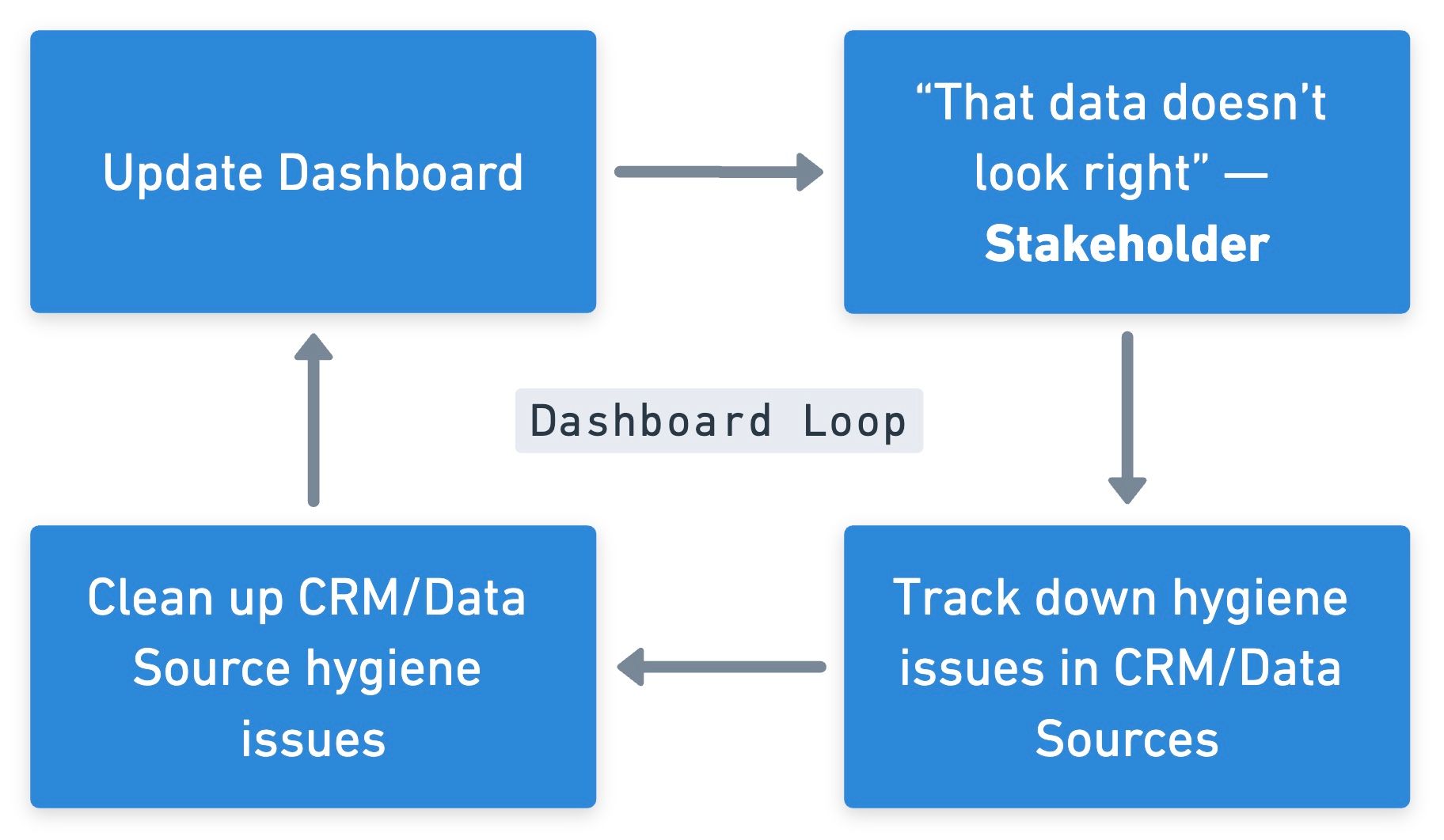
But if you look at every dashboard as a hygiene dashboard (and message that fact appropriately), you’ve actually started to do something very powerful. By turning that spotlight on and channeling the attention of senior executives toward the issues with your systems and data, you’re making an implicit argument for the value of data cleanliness.
Instead of telling a senior executive “our data quality is bad and we need to take time away from key initiatives to fix it,” you’re saying “look at this dashboard that would help you make important decisions. This data doesn’t look right, does it? How about I take some time to fix it for you.” It’s often tough to get buy-in for data cleanup efforts, since they can feel like a waste of time to non-operators. By presenting a dashboard with obviously incorrect data and highlighting that that data stems from your CRM or your MAP, you’re able to drive home exactly how broken things are and, simultaneously, demonstrate the value that comes with fixing them.
This isn’t a comfortable approach, partly because it requires vulnerability.
Personally, I hate presenting work that’s unfinished, incorrect, or really anything less than perfect. It’s just not a great feeling. But lately, I’m finding a lot more value in presenting the v0.5, the partially-built dashboard full of glaring holes and omissions, than I ever did presenting the neat and tidy v1.0 with all the issues hidden away.
On a human level, this also shifts your relationship with your coworkers and with your executives. Instead of stakeholders reacting to a final product, they become collaborators, helping you refine the eventual product to more closely match their needs. This definitely won’t work with everyone — not every stakeholder wants to be a collaborator, so use your best judgement here (seniority is often a useful guide here). But exposing that vulnerability to clients or coworkers can go a long way toward strengthening those relationships.
You build more trust exposing the messiness than you do shoving it under the rug.
Everyone knows (or at least everyone should) that systems get messy. The business takes its collective eye off the ball for 5 minutes and suddenly there’s hundreds of opportunities without primary contacts, dozens of workflows routing to former employees, and thousands of contacts lacking key fields. It’s not really anyone’s fault, it’s just a natural consequence of the complex environments in which we operate.1 Reality tends toward entropy.
It doesn’t matter until it does, and dashboards are a great way of making it matter. Which is a net win for everyone in the end, even if it means signing up for a lot of data cleanup work in the near-term.
These also happen to be things I can help with↩︎
Written by Jack Segal. Shoot me an email with questions or comments, and if you'd like to support my writing, you can send me a tip using Stripe!
Date
2024-01-09Subscribe
Fill out the form to get notified whenever a new post goes live!